Iterative Design Process
designing the first mobile interactive video recorder
Screenlife stands out from the competition because it saves recordings as interactive video files. When a user watches a Screenlife video, all links and buttons inside the recording remain clickable and active.
chapter i
Context
The Background.
The product started as a Chrome extension. Stakeholders needed a mobile app to build a community and expand the user base beyond desktop users.
The Challenge.
- Keep features simple despite complex recording technology
- Move fast (startup speed) while maintaining quality
- Adapt a comprehensive web platform to mobile screens
chapter ii
Research & Constraints
Initial research included competitive analysis, review of Screenlife products, stakeholder interviews, and documenting all UX flows.
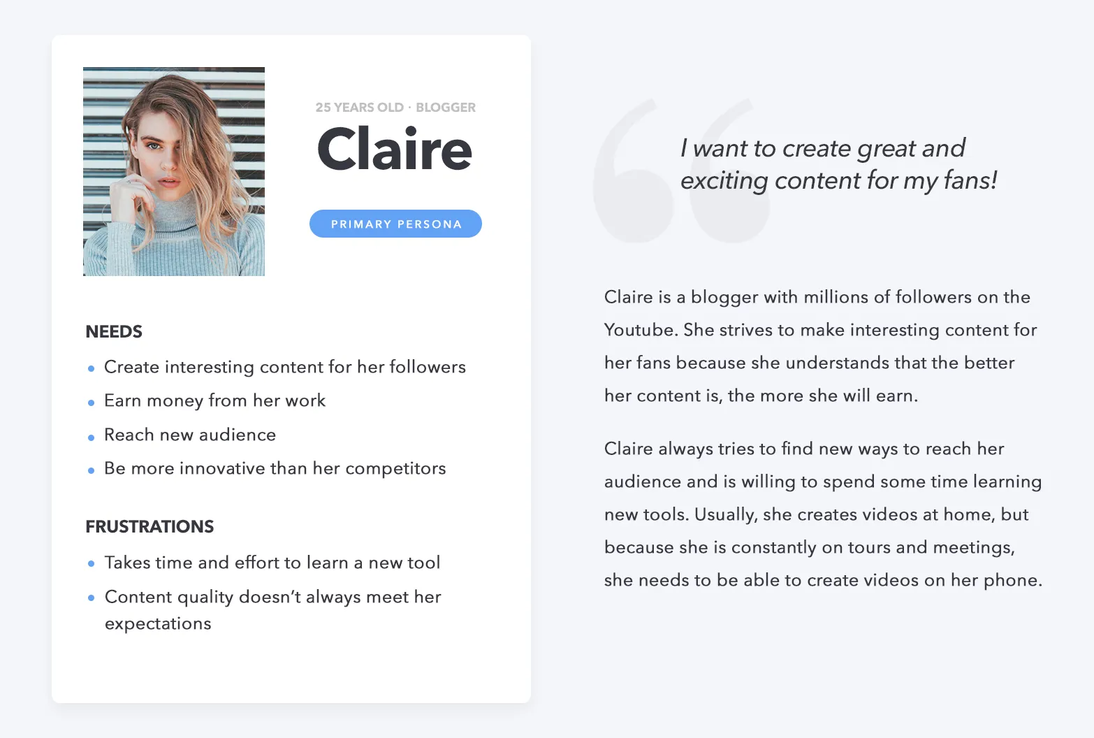
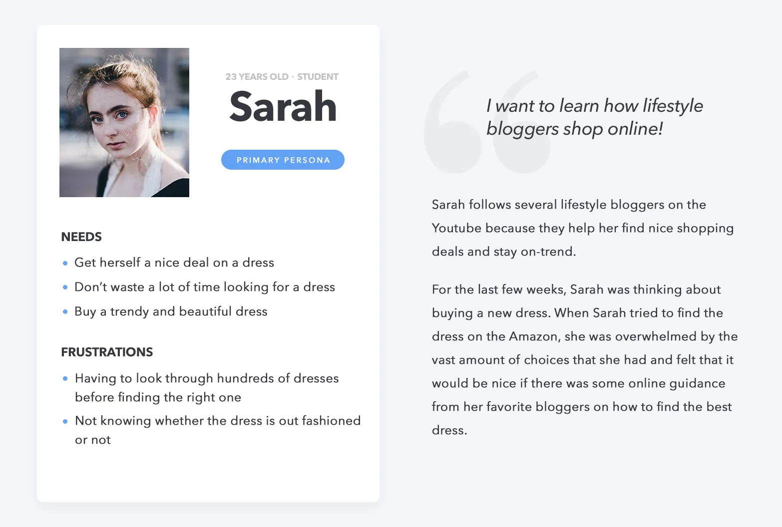
Lacking access to real users initially, I created provisional personas based on stakeholder interviews to guide the early design.
chapter iii
Ideation
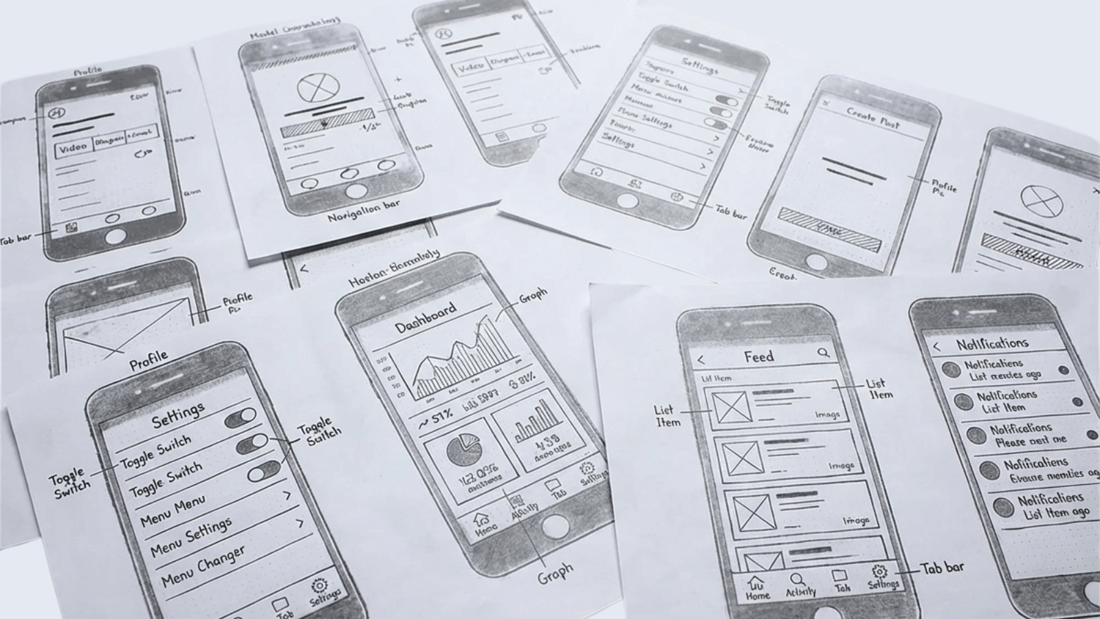
We used paper prototypes to adapt web flows to mobile. This allowed developers to spot technical limitations before code was written. Low-fi prototypes allowed us to find the right ideas quickly.
chapter iv
High-Fidelity Mockups and Animations
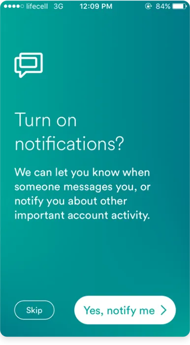
Onboarding
Moving to high-fidelity, we prioritized onboarding to explain the technology. While we initially planned heavy animations, scope constraints pushed them to later versions. This proved beneficial, as usability testing later revealed the onboarding flow was already a significant friction point.
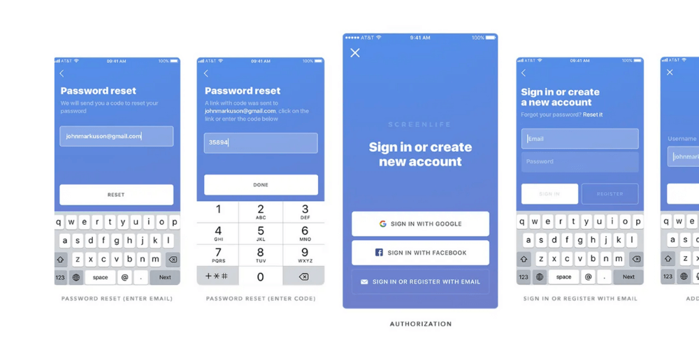
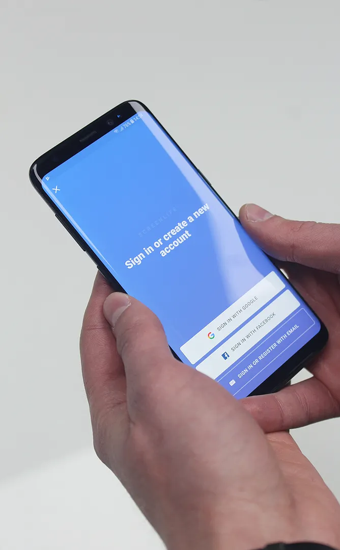
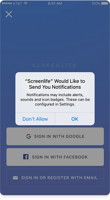
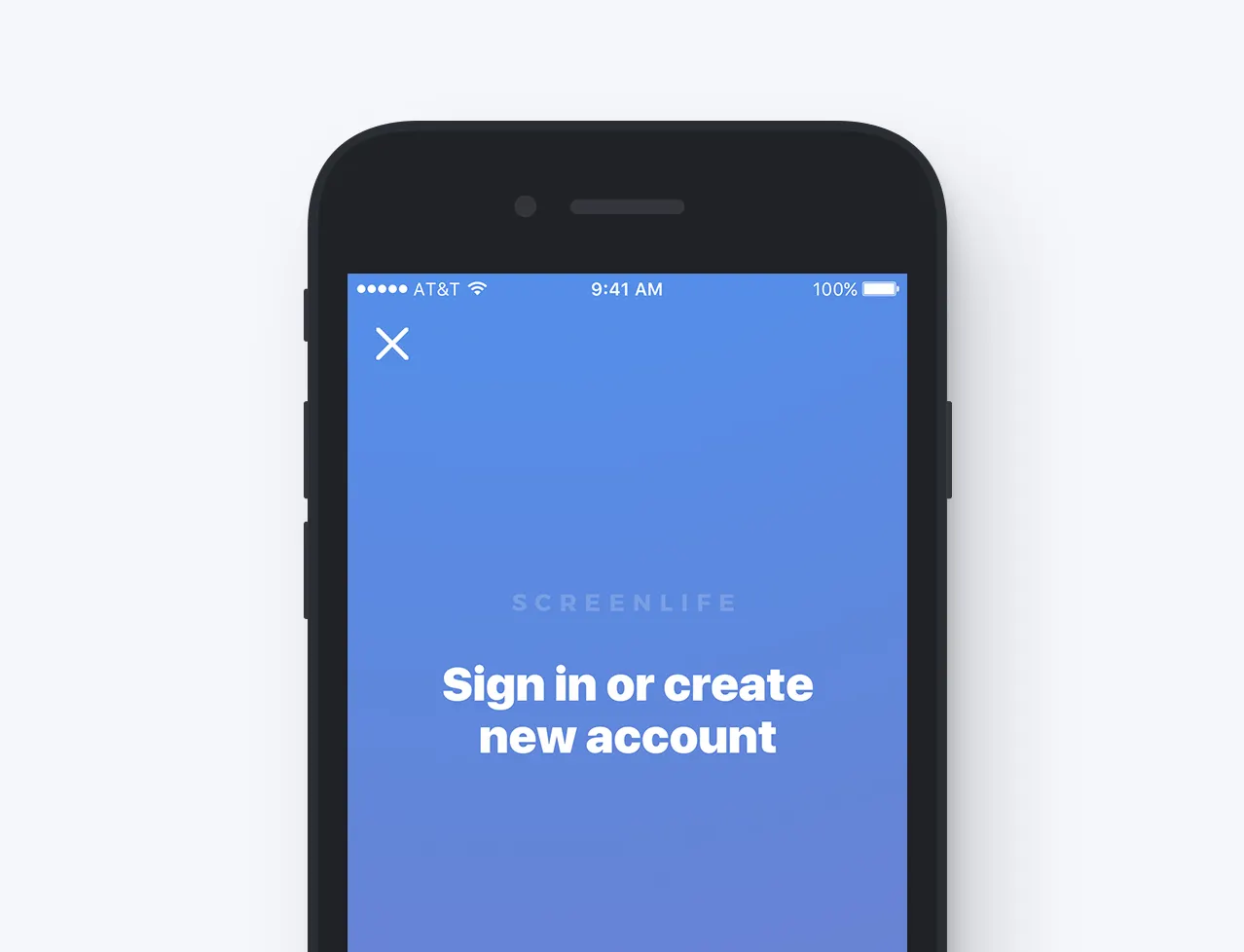
Authorization
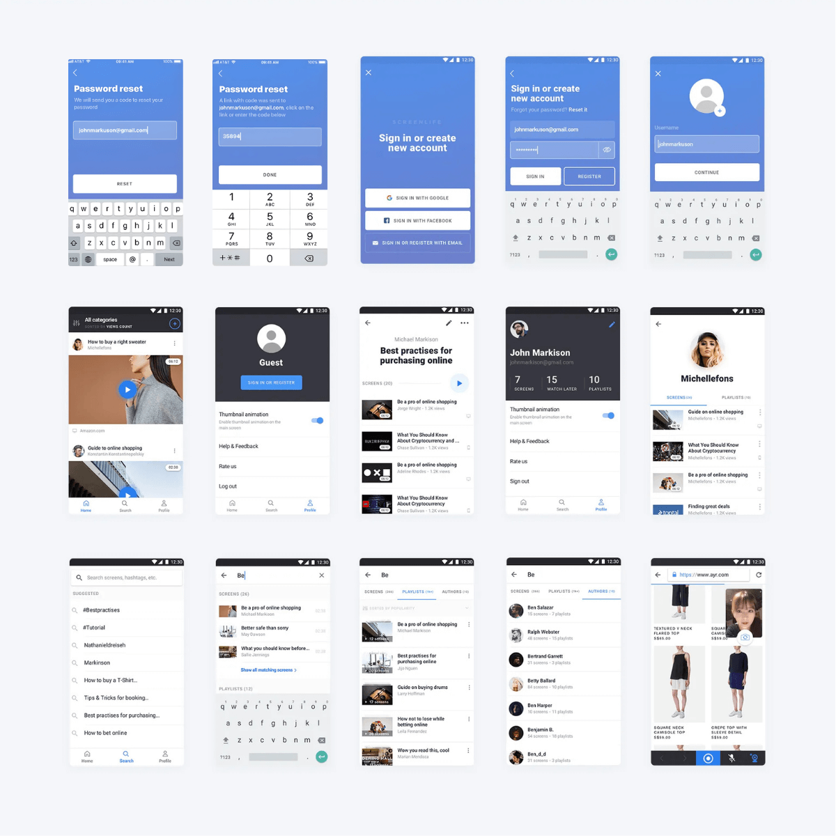
I used Sketch to design the remaining iOS and Android mockups. To meet deadlines and reduce bugs, I prioritized native OS components over custom UI, which significantly streamlined the development process.
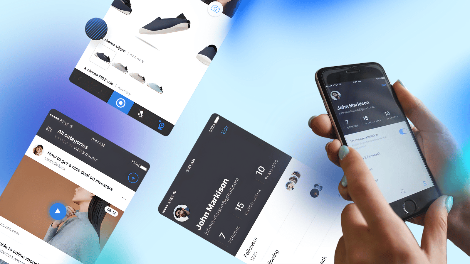
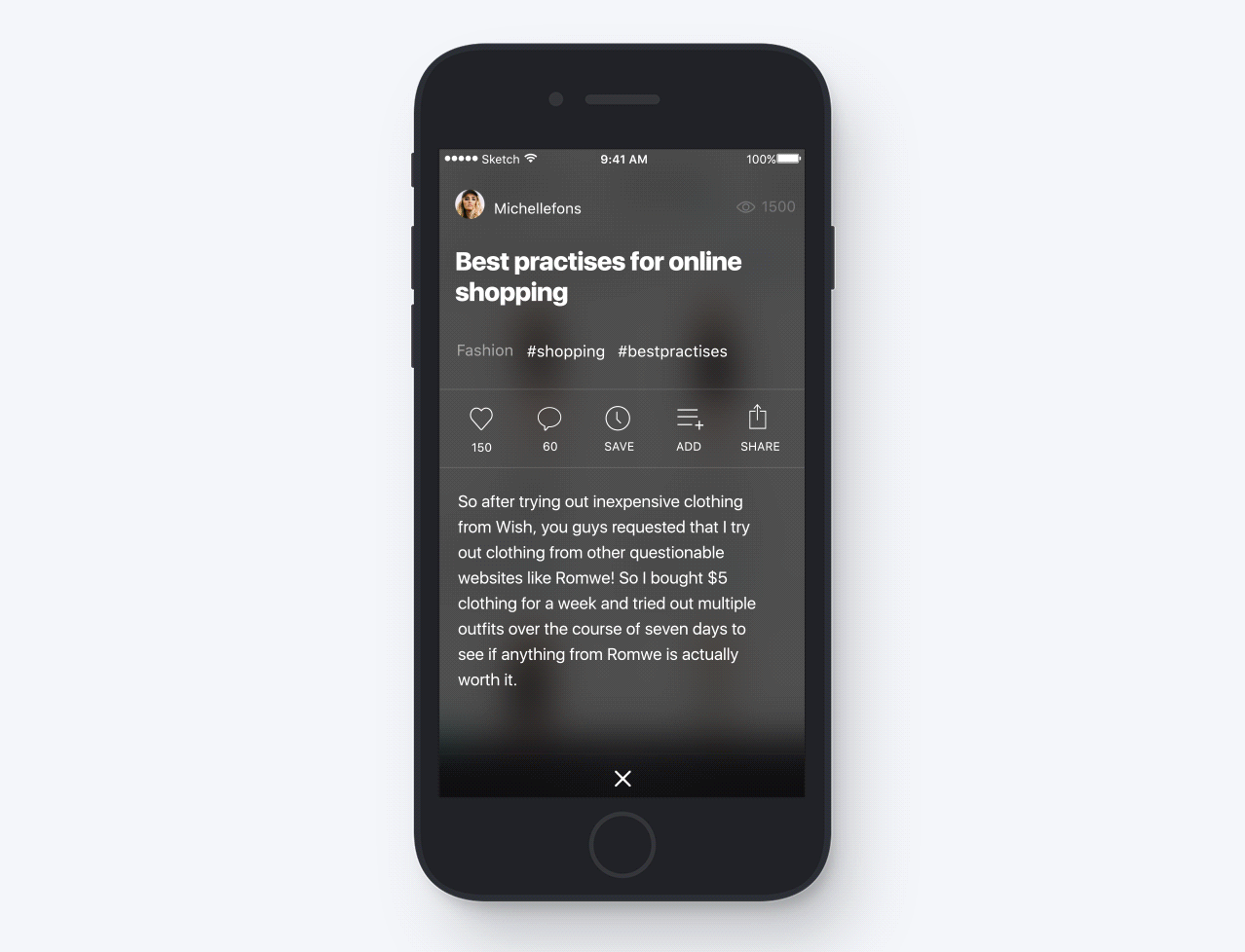
Interact with Recordings
Video elements are fully clickable. Users can add products to a cart or visit websites directly from the player.
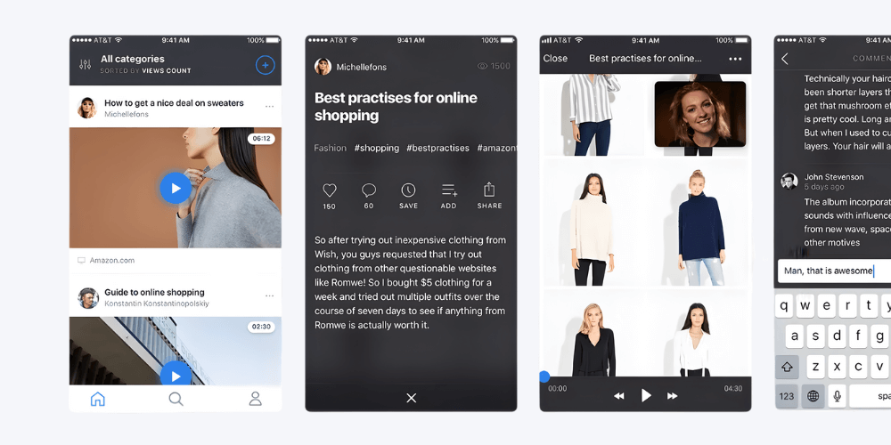
Create Content
Effortlessly record interactive tutorials, product tours, and immersive stories.
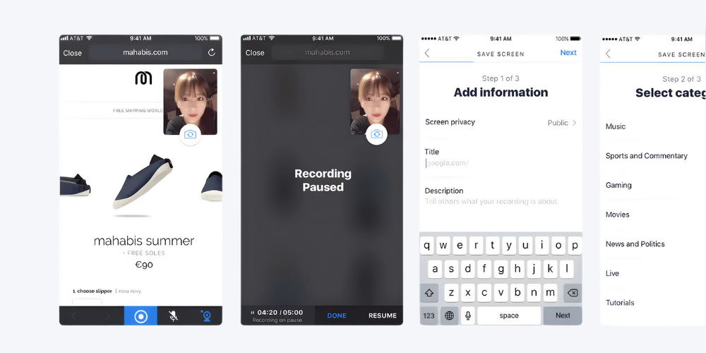
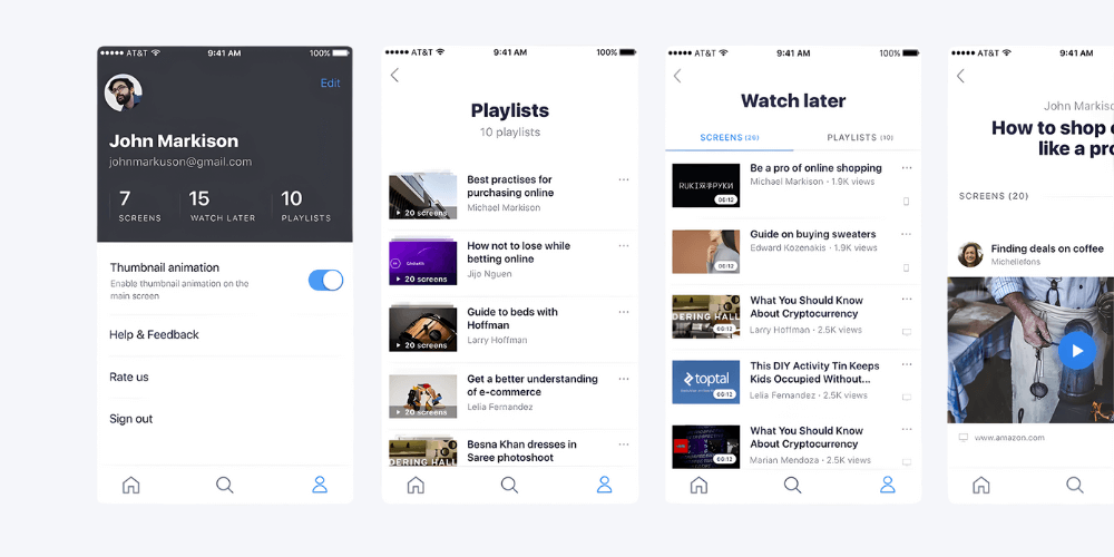
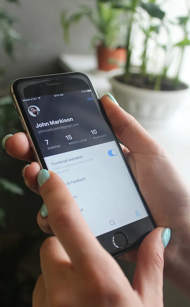
Build Your Profile
Curate recordings into private or public playlists to share with friends and the Screenlife community.
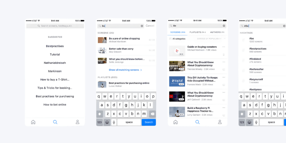
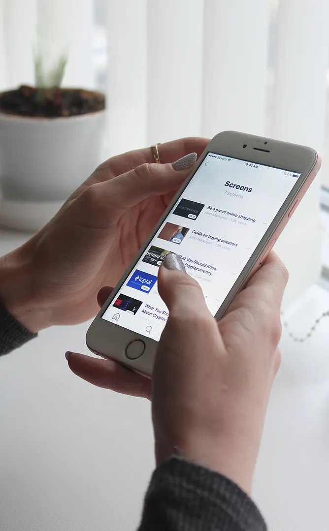
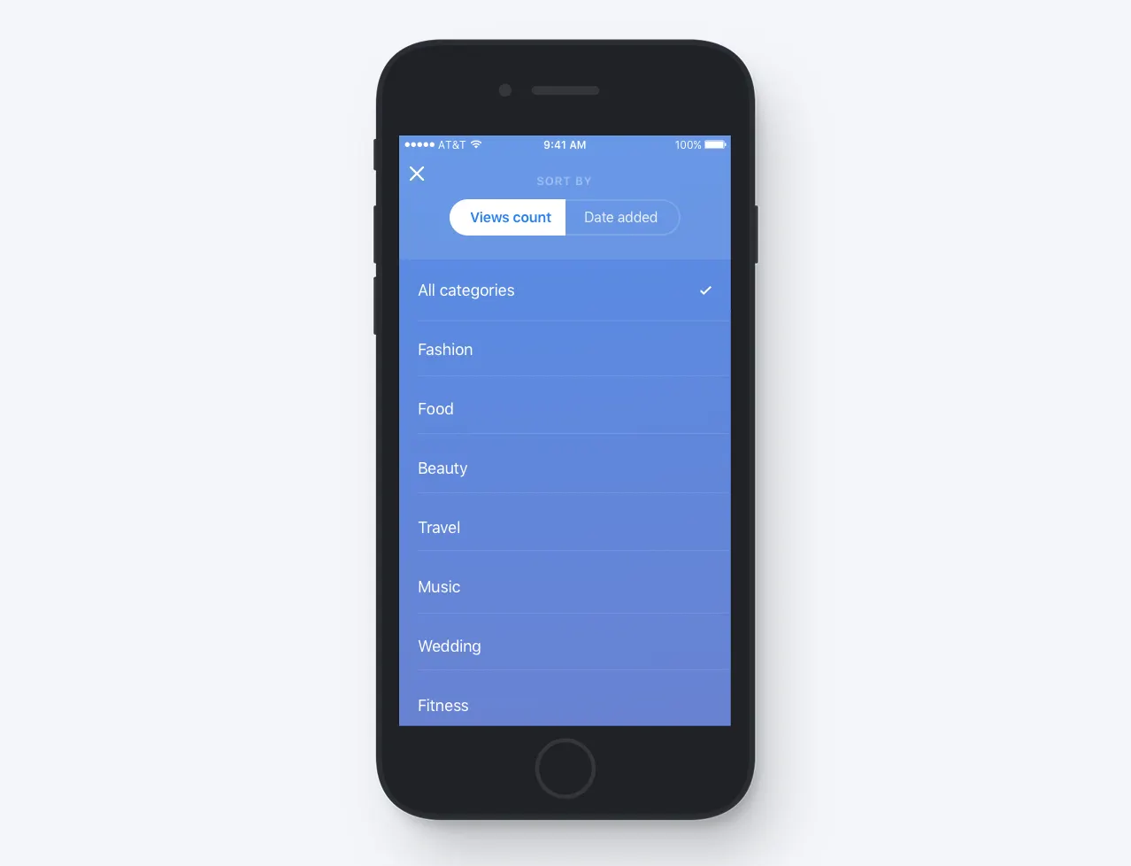
Search & Discover
Find content easily by searching hashtags, creators, or video titles.
The Android App
Additional work has been done to make sure that users with low-resolution Android phones would have a nice user experience too.
First usability testing sessions
chapter v
Phase 1: InVision Testing
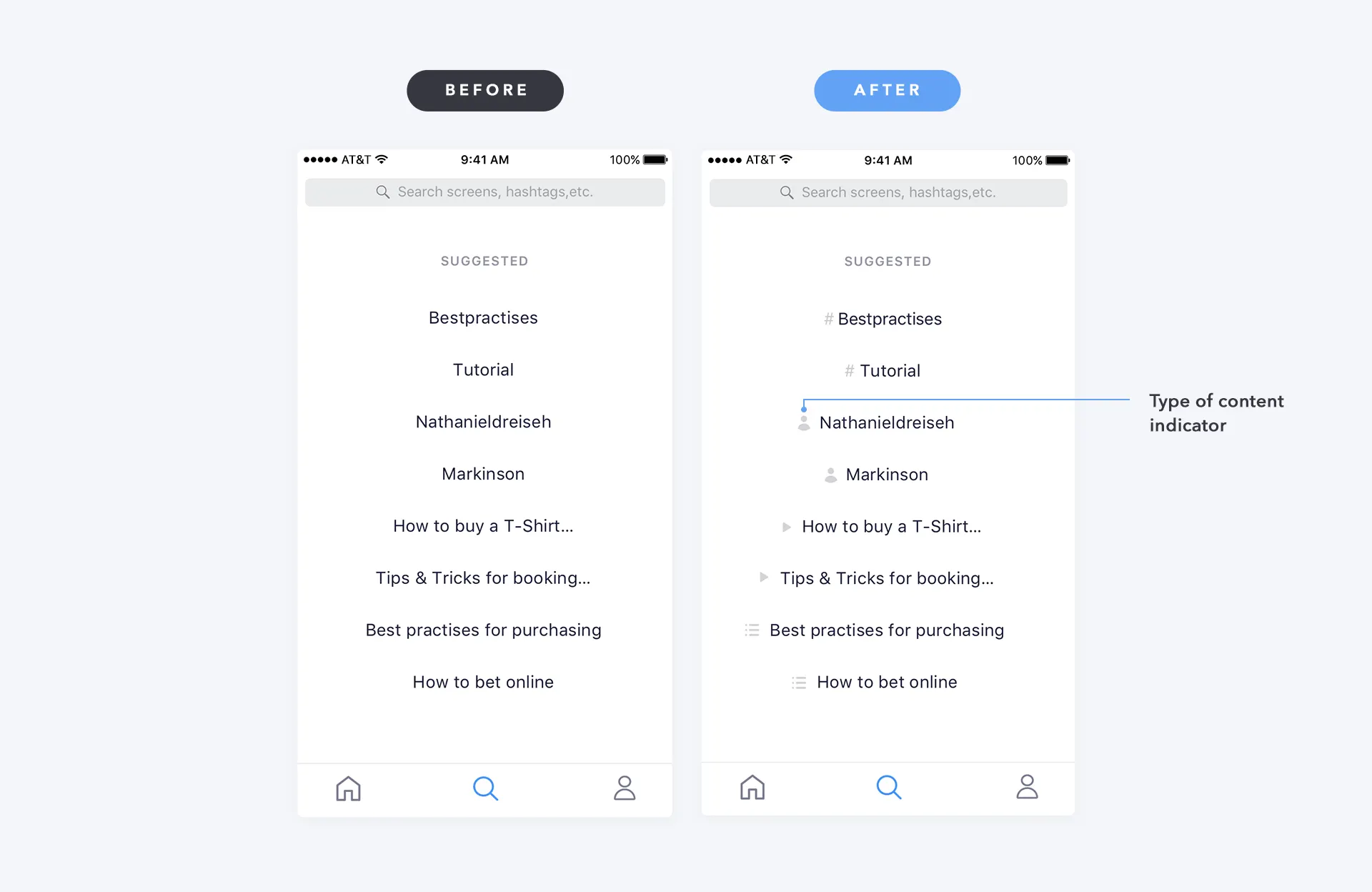
Search Clarity
Users couldn't distinguish between links, authors, and hashtags in search results.
solution:
Added content type icons to each search result for instant recognition.
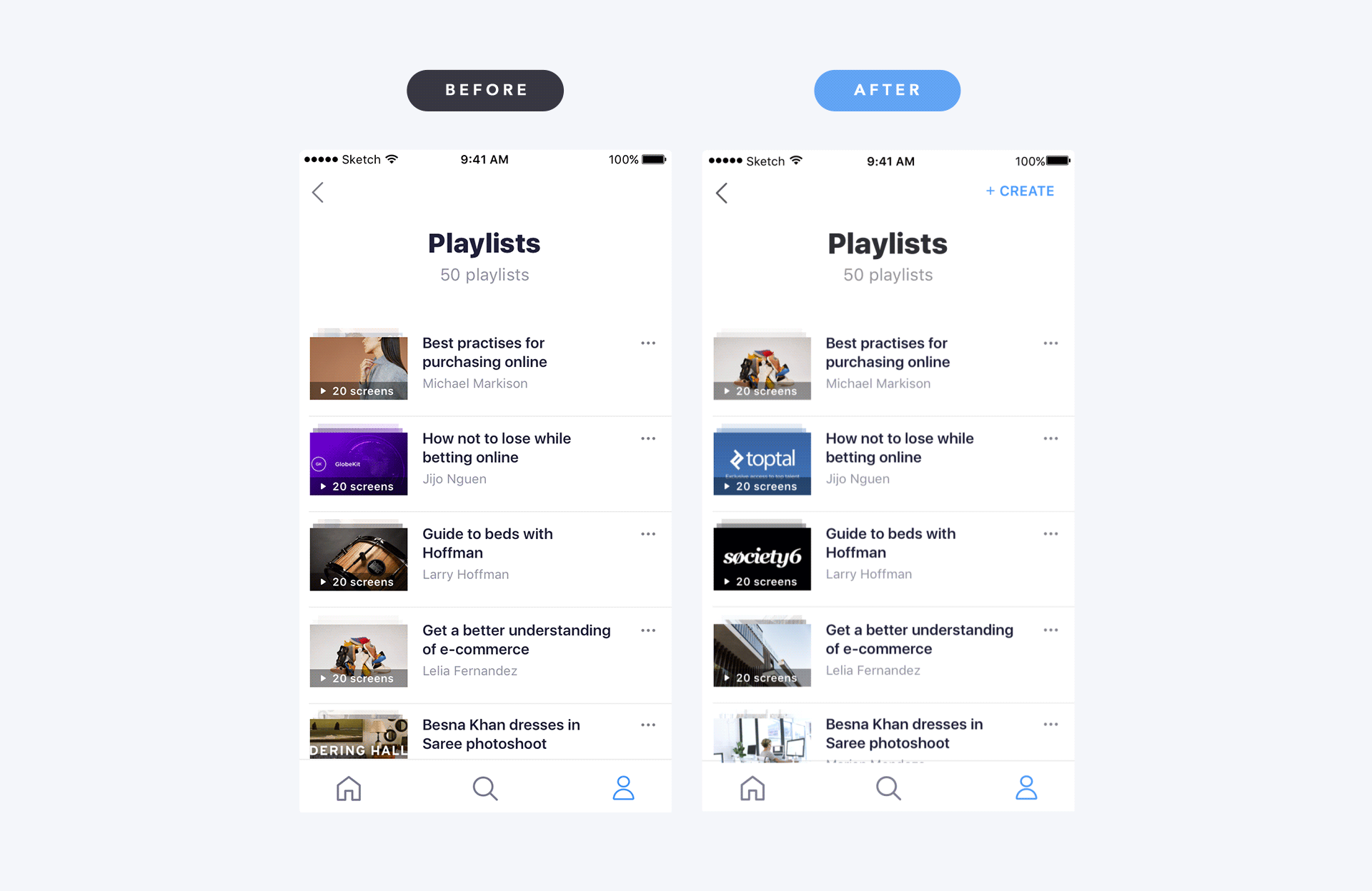
No Playlist Creation
Users couldn't find how to create a new playlist within the app.
solution:
Added prominent “Create” button to the playlist screen.
Player Behavior
Users expected the player to minimize like YouTube when navigating away.
solution:
Added minimization logic with persistent mini-player.
chapter vi
Design QA
With 60+ screens in development, I conducted design reviews to fix execution gaps in spacing and layout. Small details (margins, spacing) were missed during implementation, so I created design review docs to align code with design.
comments
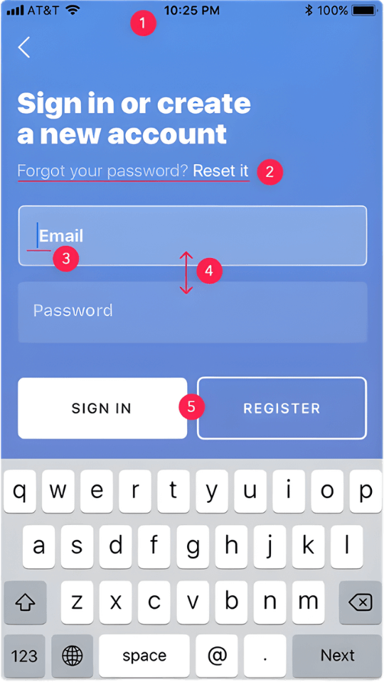
- 1.Change the status bar color from black to white #ffffff
- 2.Change the font weight from Regular to Medium
- 3.Change the cursor color from blue to white #ffffff
- 4.Decrease the margin between fields by 50%
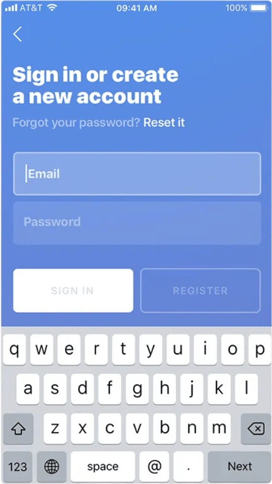
- 5.Buttons should be disabled until the users enter their email and password
before
after
chapter vii
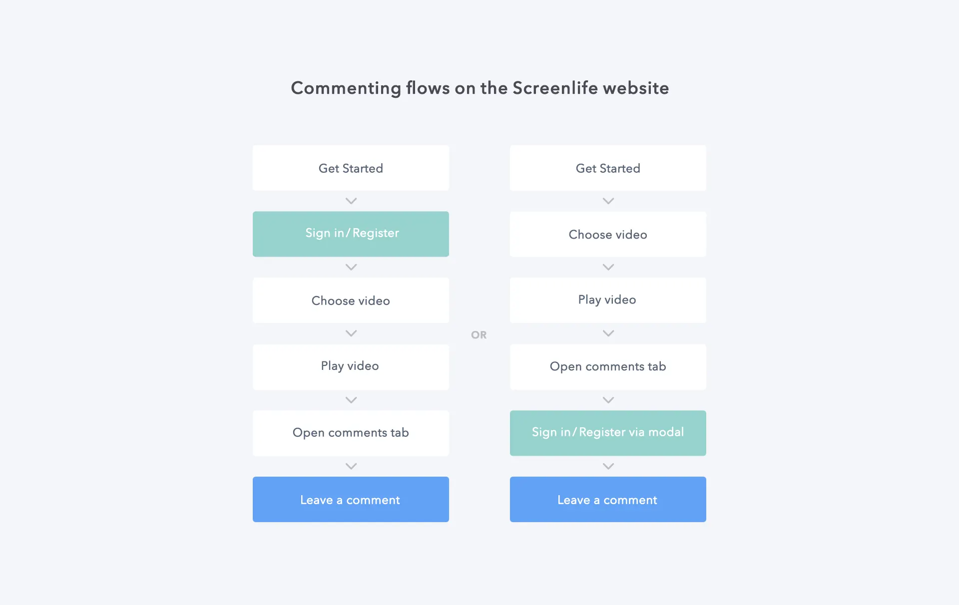
Remote Usability Tests
We validated core flows through remote unmoderated testing. While some feedback was subjective, the data successfully exposed critical friction points, specifically the need to refine our search filtration.
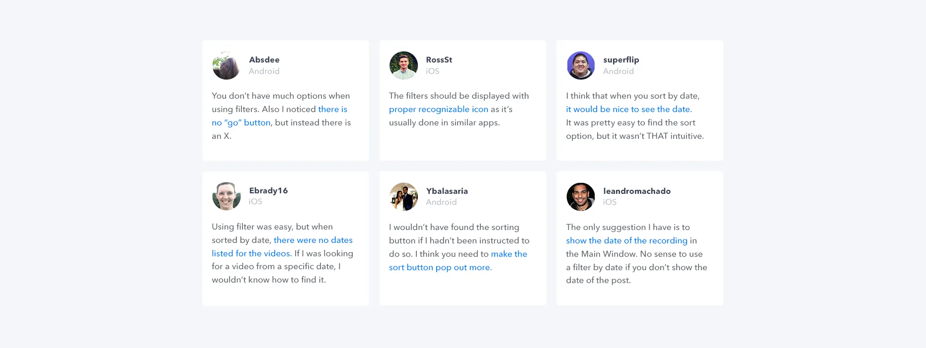
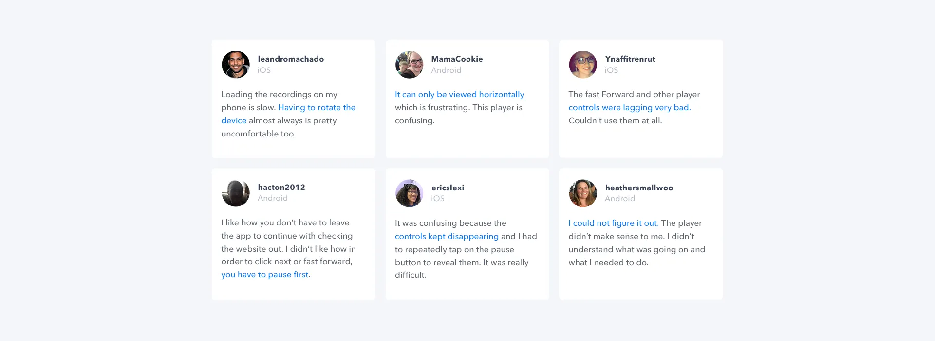
Feedback highlighted friction with player controls and frustration with the forced landscape mode.
Some users hated our app, and some fell in love.
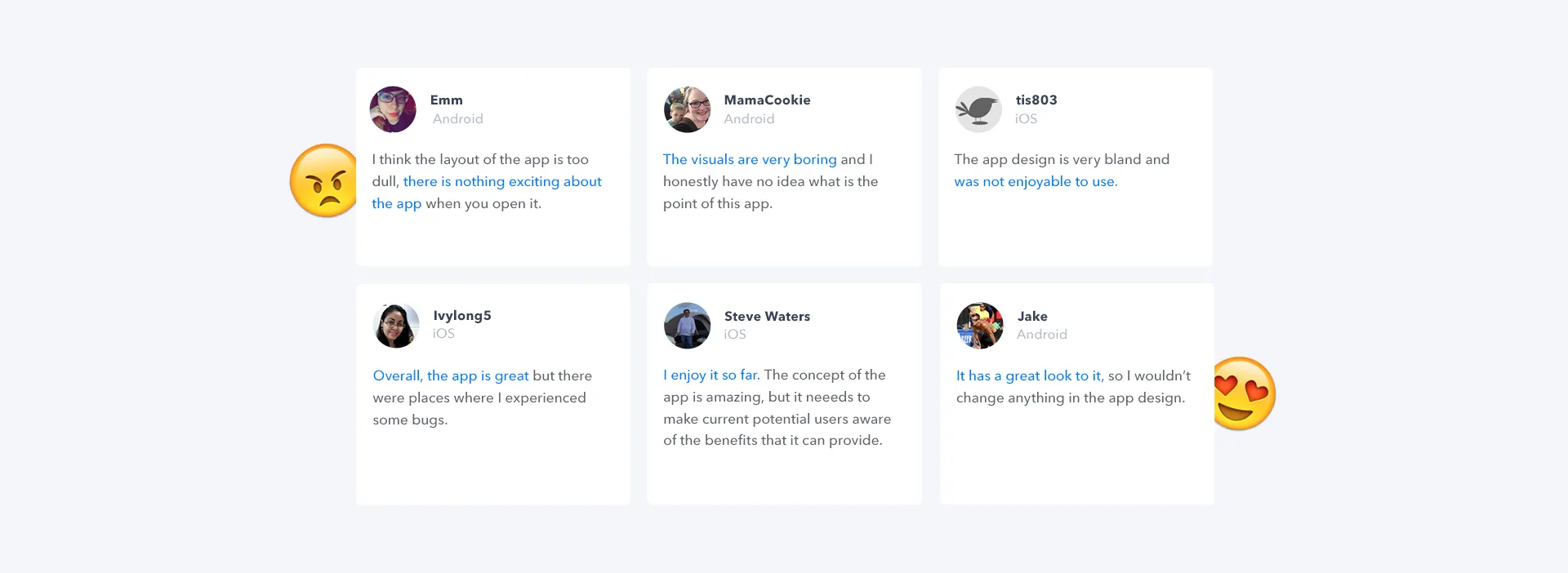
The results made it clear that we needed to continue testing for more robust feedback.
chapter viii
Phase 2: Onsite Testing
24 Issues Found
Permission Dialogs
Users denied native prompts immediately. We moved to custom pre-permission primers.
Sign-in Barrier
Users missed the “Skip” button. We redesigned the header to make it prominent.
Filtering
Applied filter state was unclear to users. We added better active states.
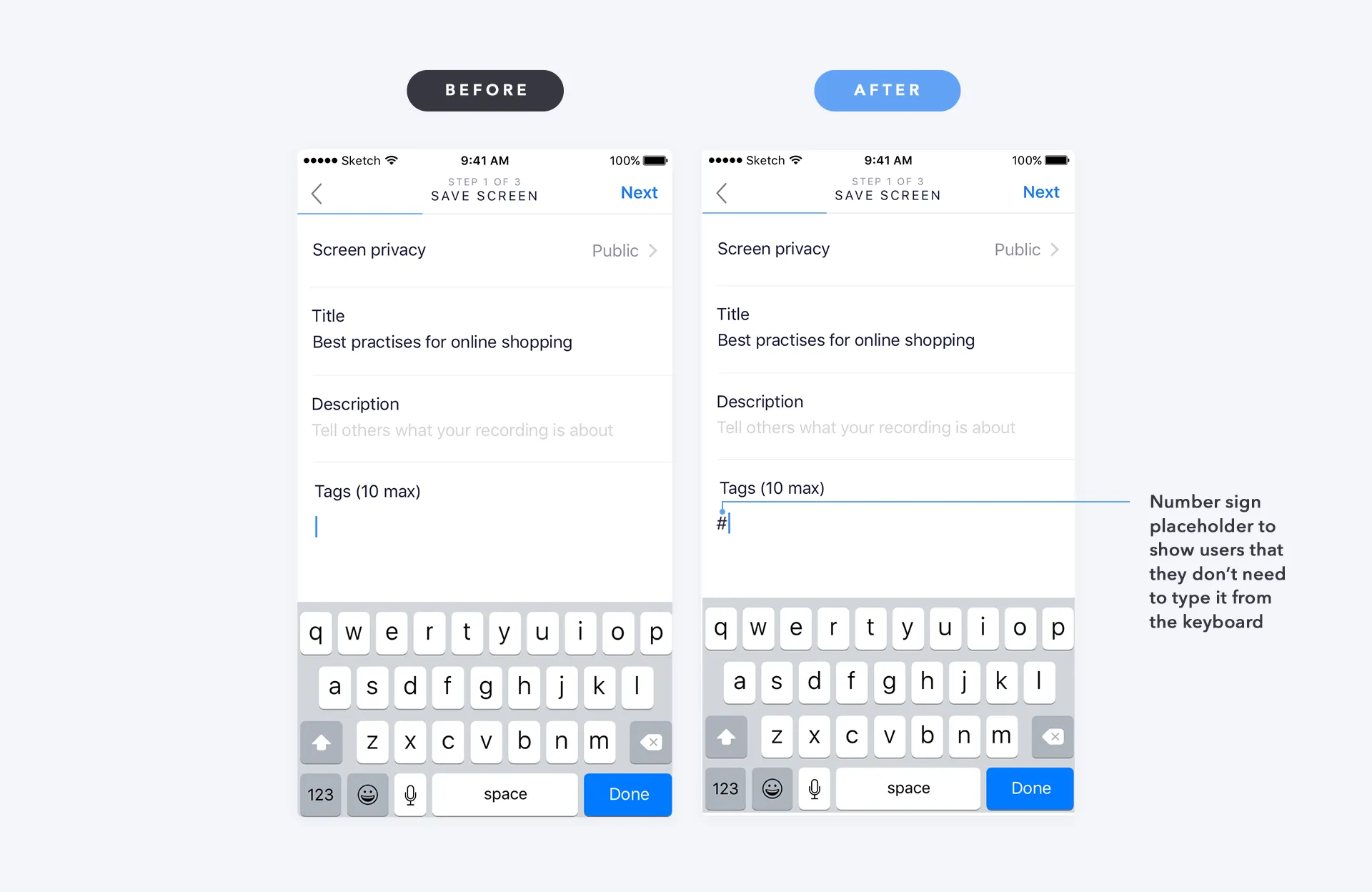
Hashtag Input
Users tried typing “#” manually. We added an auto-placeholder.
chapter ix
Refinement & V2
Based on the 24 issues, we shipped a major redesign focusing on clarity and social features. We added time/likes/views to thumbnails, sorting tabs (Popular/New/Following), and prioritized the Follow feature.
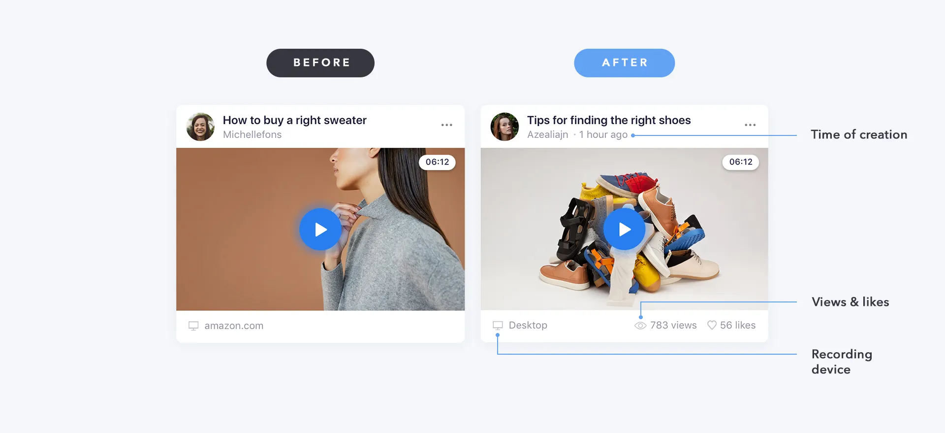
Adding metadata (time, views, likes, device) to video cards
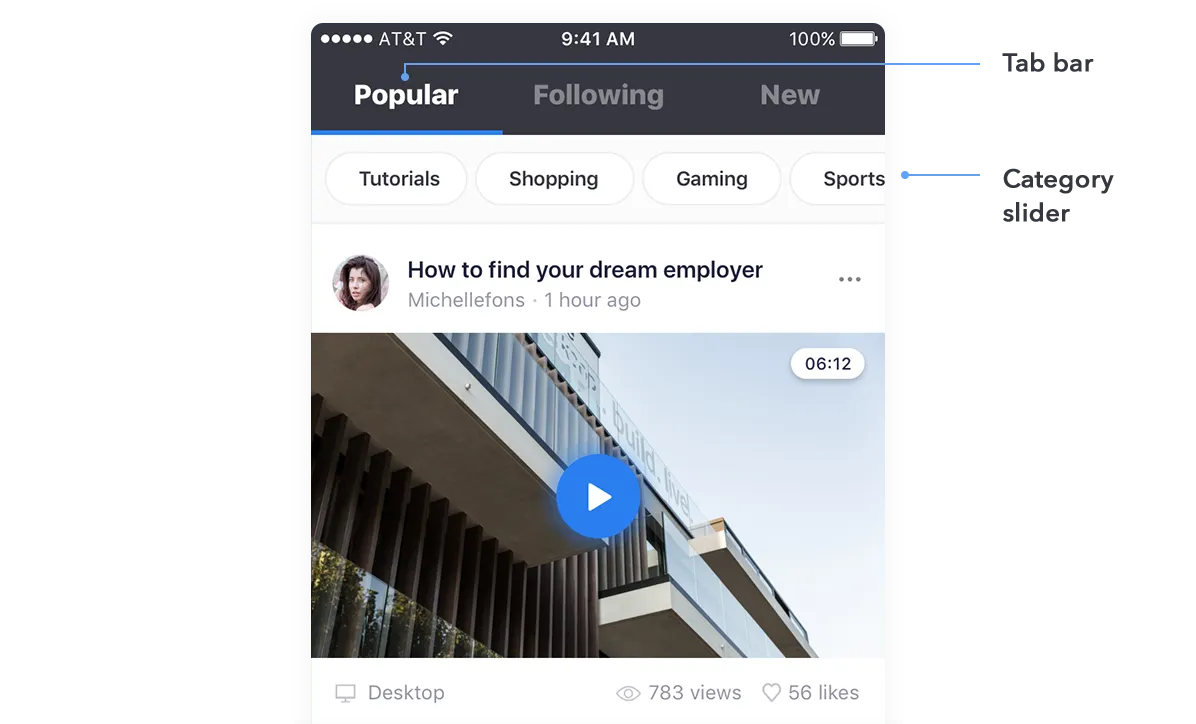
New tab bar and category slider for content discovery
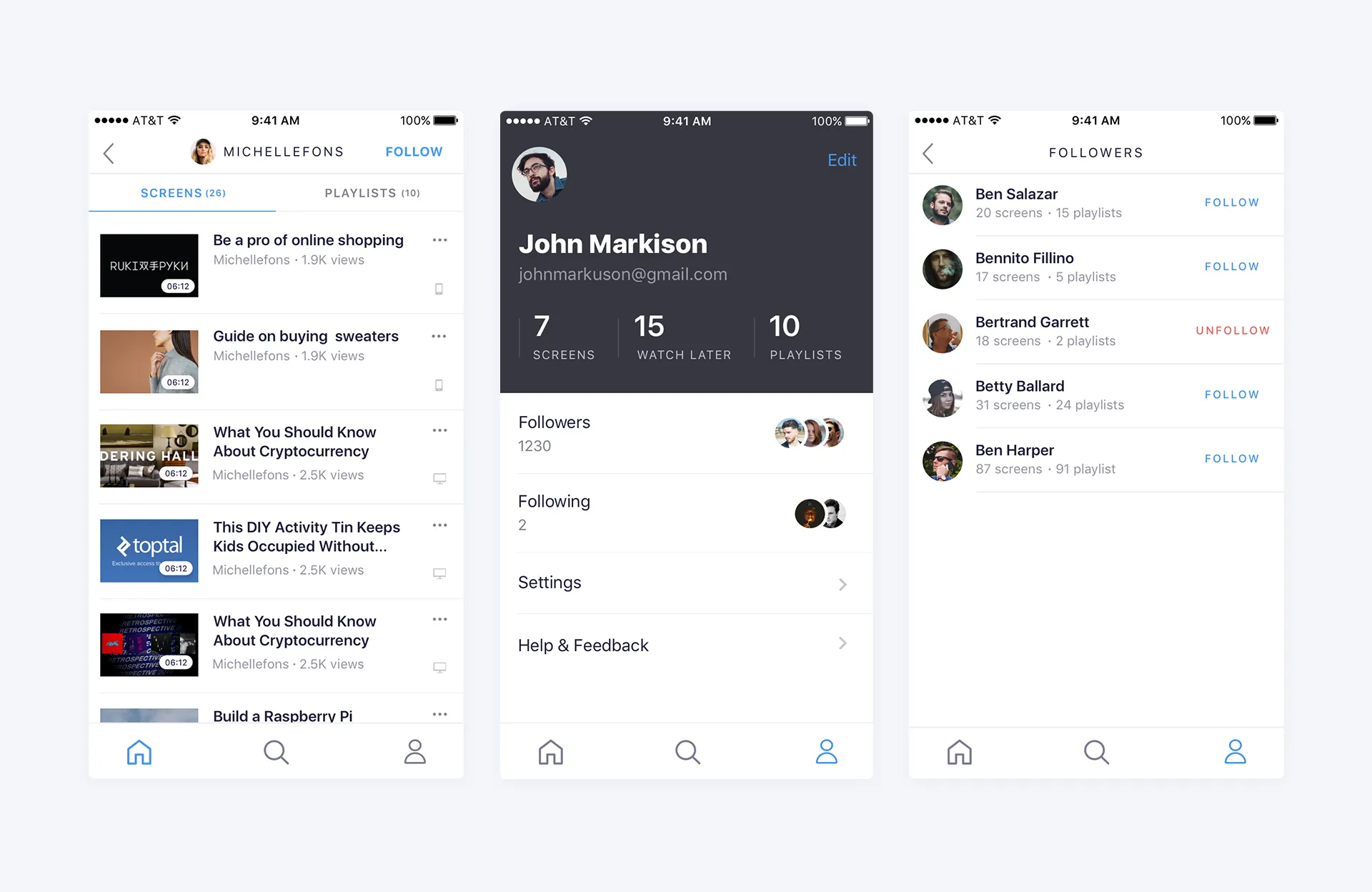
Enhanced social features: profiles, screens, and followers
chapter x
Key Learnings
Access to End Users is Vital
Basing personas on assumptions was a risk. Direct user access would have accelerated validation.
Jobs-to-be-Done over Personas
JTBD framework better explains why users act. Focus on motivation, not demographics.
Test Earlier
We should have tested paper prototypes instead of waiting for high-fidelity. Validate logic before pixels.
thank you for reading
back to all projects