Adding AI to iMessage is not adding a feature. It's editing the most personal app on someone's phone.
This is what that design problem actually feels like.
A crowded market,
and a gap nobody filled.
I screened 412 iMessage apps and the top group-chat tools before designing anything. The market was busy but fragmented: every capability existed on its own, none of them together.
I dumped every observation onto a board and clustered until the themes named themselves. One note kept surfacing under trust, and it became the thesis of the whole product.
Design-target archetypes, drawn from the competitive gap and the problem space.
Designing for AI is designing for uncertainty.
The hardest part wasn't the model. It was the mental model.
Generative AI in iMessage is high-stakes by default.
In a productivity tool, generative AI is forgiving: a slightly-off summary gets fixed. In iMessage, a reply you send is a reply from you. Wrong tone breaks the relationship. Too generic reads robotic; too clever reads like an AI wrote it.
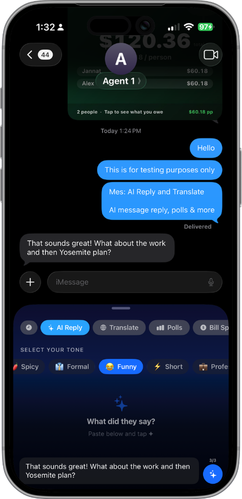
Three options, not one.
A single "best" reply forces a binary: accept or rewrite. Three options create a comparison space, and comparison shifts the user from evaluator to editor: pick the closest match, then tweak. That mental shift is everything.
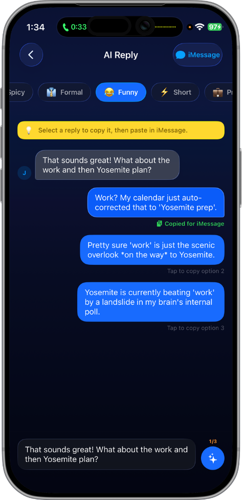
Tone as a first-class control.
Most AI reply UIs hide tone behind a generate button. Mes makes it the primary interaction: three chips, picked before generating. The user steers the AI's voice instead of auditing its output. Trust comes from agency.
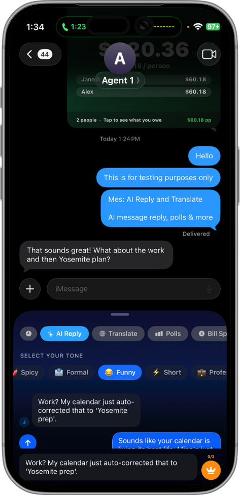
Bubbles, not list items.
Reply options render as iMessage bubbles, not menu rows, so the user sees each message in the form it will take: no translation step between preview and reality. And nothing sends on its own. The reply you pick drops into the compose field to edit first, so the AI drafts but never speaks for you.
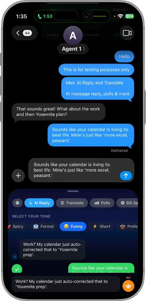
Generate a reply.
Pre-canned tones, but the choreography is exactly how the real feature behaves.
Trust in generative UI comes from agency, not accuracy.
How it's wired.
Two decisions shaped everything downstream: the reply flow keeps a human in the loop, and the app splits across an in-thread extension and a full main app.
The preview → edit loop is the whole design bet: the AI drafts, the human approves. Nothing sends on its own.
The split is the architecture: the extension stays in the thread, the main app holds everything that needs room, and an App Group shares state between them.
Six tools. One language.
AI Reply is the headliner, but Mes is a platform. Five more tools cover the rest of what group chats need, each built from the same component vocabulary, each ship-quality on its own.
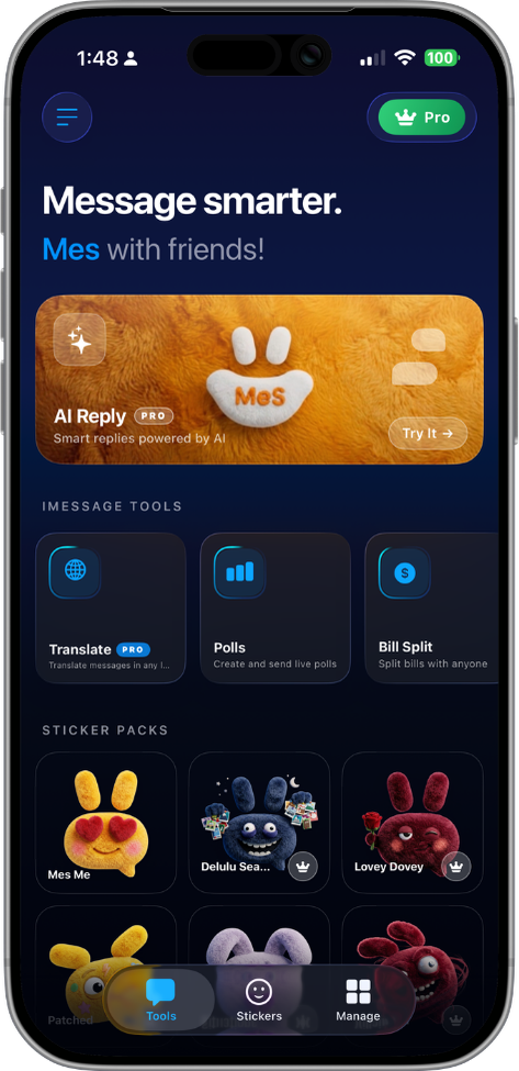
Reply in your voice, not the AI's.
Three tones, three options each, generated by Gemini 2.5 Flash. The user picks the tone before generating, steering the AI's voice rather than auditing its output.
Real-time polling. No backend.
Interactive cards that update inside iMessage as participants vote. Multi-choice and star-rating. State lives inside the MSMessage URL: no server, no sync, no lag.
Settle the bill in three taps.
Even or custom splits for up to 10 people. Tip presets and custom percentages. One-tap Venmo or Cash App handoff per person, routed through the main app to satisfy iMessage sandboxing.
Let the wheel decide.
A weighted decision tool for groups. Spring-physics spin animation tuned for natural deceleration. Result card auto-inserts to the thread.
Count to what matters.
Shared event countdowns rendered in the recipient's local time. Cards update each time the thread is opened. No backend, just smart re-rendering.
Reactions, curated.
Six packs covering the full emotional range of group chat. Sticker store syncs across the main app and extension via App Group. Cat Reacts ships free.
The reply screen,
three drafts deep.
The AI-reply screen carries the whole trust idea, so it took the most iteration. From a paper sketch full of question marks, to an annotated greyscale wireframe, to the shipped screen, each pass locked one decision.
Where does the reply even go?
The first sketches were about placement and open questions, not polish: does tone come before or after the draft, and where does the draft live so nothing sends by accident?
Tone before draft, preview before send
The greyscale wireframe resolved the two questions from the sketch: tone selection sits above the draft, and the draft is a preview card with an explicit Send, annotated for handoff.
Approve, don’t autopilot
The shipped screen keeps that structure and adds the real voice: the AI drafts in a card that never enters the thread until you tap Send, with regenerate one tap away.
One system, two targets.
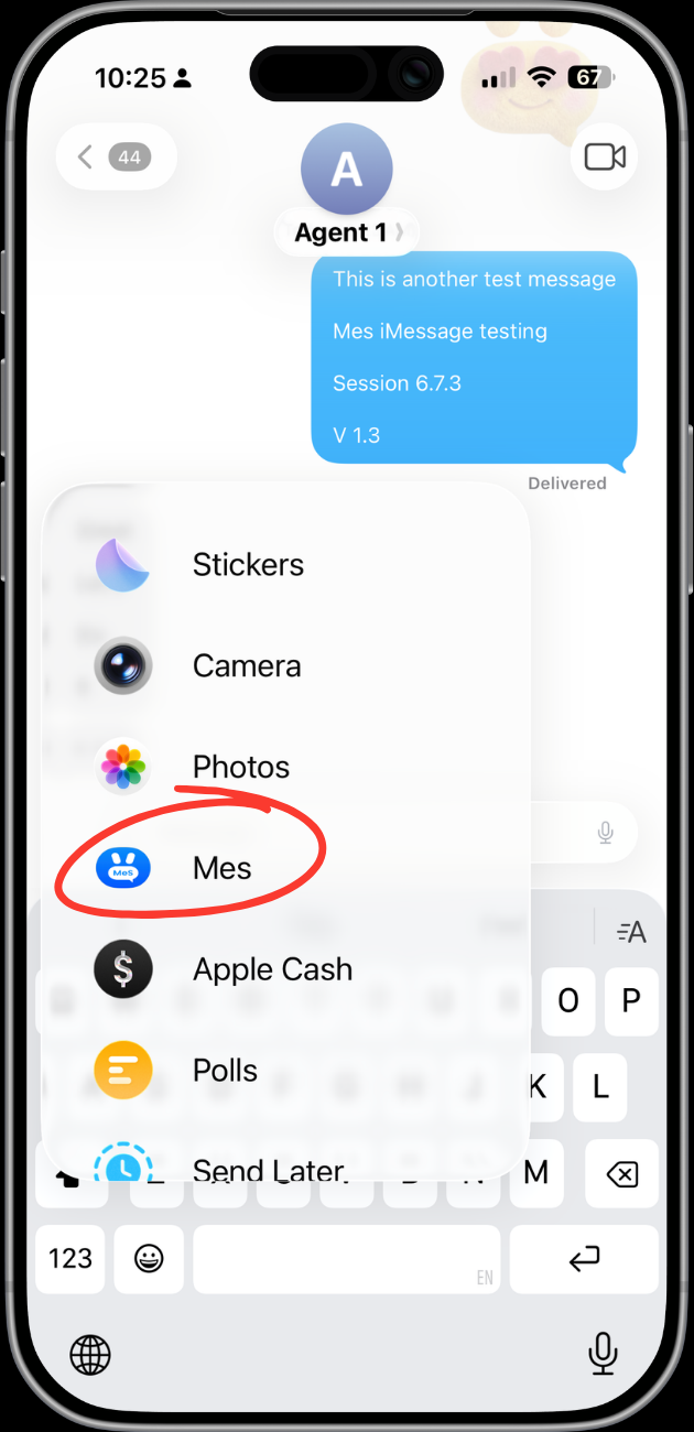
Mes ships as two Apple targets sharing one design language: a main app for paywall, onboarding, and the sticker store, and an iMessage extension for the tools. Every component had to work in both, and the library lives in production Swift, not just a design file.
Mascot.
A plush bunny named Mes that carries the brand's emotional range through a single accessory. No crown in onboarding: welcoming. Gold crown in the paywall: aspirational. One character, two registers.
Color tokens.
Deep midnight base, a saturated iMessage-blue accent, and a warm cream for text, never pure white. Two hairline tints carry every division.
Typography.
Bricolage Grotesque carries every display moment; Geist handles body and UI; JetBrains Mono labels the technical and editorial eyebrows.
Components.
Bubble UI as the dominant metaphor. Liquid-glass pills, a custom bounce button, spring-physics progress, each a reusable view shared by both targets.
Design → Xcode.
Every component existed in design and SwiftUI at once. No handoff, just the same person committing both files to git in the same hour.
Three constraints. Three design decisions.
iMessage extensions are the most constrained surface Apple ships. Every limit became a design problem, and each solution shaped the product's character.
The 60MB ceiling.
iMessage extensions are hard-capped at 60MB of memory. The AI model can't run inside the extension, and calling the Gemini API directly is a crash waiting to happen.
The main app becomes the AI brain; the extension stays a thin client. API calls fire from the main app and write results to an App Group container. The bridge is a URL scheme handler (mes://) the user never sees but the architecture depends on.
Responses had to feel instant in the extension even though they were generated outside it. The fix was eager pre-generation: the extension requests replies before the user has even picked a tone.
// AppGroupBridge.swift: extension → main app communication.
// iMessage extensions have a 60MB ceiling, so AI calls run
// in the main app and results sync via App Group.

enum AppGroupBridge {
    static let appGroupID = "group.com.gya.mes"
    static let defaults   = UserDefaults(suiteName: appGroupID)!

    static func requestReplies(for incoming: String, tone: Tone) {
        defaults.set(incoming, forKey: "pendingMessage")
        defaults.set(tone.rawValue, forKey: "pendingTone")
        NotificationCenter.default.post(name: .mesAIRequest, object: nil)
    }

    static func cachedReplies() -> [String] {
        defaults.stringArray(forKey: "cachedReplies") ?? []
    }
}
No UIApplication.shared.open.
Inside an iMessage extension, you can't open URLs the normal iOS way: Apple's sandboxing forbids it. That breaks Venmo, Cash App, every deep-linking pattern designers reach for first.
Every payment handoff goes through a NotificationCenter event the main app observes: the extension posts the intent, the main app acts on it. Tapping Venmo opens Venmo, even though the actual call happens in a different process.
The bill split UI couldn't promise instant handoff, so it doesn't try. Buttons animate to an "Opening Venmo…" state for ~200ms before the app switches. The micro-interaction covers the architectural seam.
iMessage is stateless.
An iMessage app has no backend. Every piece of state (poll votes, wheel results, countdown updates) lives inside the MSMessage URL itself. The message is the state.
Polls re-render and re-insert into the thread on every vote, replacing the previous version. The card looks live, but it's recomposed each time: the user perceives real-time updates while the system performs stateless replacements.
Visual continuity does the work backend persistence usually does. Spring-physics animations make a recomposed card feel like the same card updating, not a new one replacing the old.
Used every day,
then handed to strangers.
Two passes pressure-test the design. First I dogfooded the working extension on my own threads across the build; that pass is done and already moved the product. Then I scoped a moderated study to put it in front of people who have never seen it, protocol below, ready to run.
Ran the working extension in real conversations across ten build sessions. Every awkward tap became a to-do. Three of them moved the design:
Tone-before-draft was the moment the product clicked, the difference between steering the AI and auditing it after the fact.
Five first-time users, five real group-chat jobs, one question the study exists to answer: can someone trust AI to help them text without it ever sending something they didn't choose?
Four months. One person. One ship.
Competitive research across 400+ iMessage apps surfaced the gap: no single app handled polls, AI reply, and bill split at a feature-worthy level of polish. PRD v2 set one quality bar: would Apple feature this?
Competitive research across 400+ iMessage apps surfaced the gap: no single app handled polls, AI reply, and bill split at a feature-worthy level of polish. PRD v2 set one quality bar: would Apple feature this?
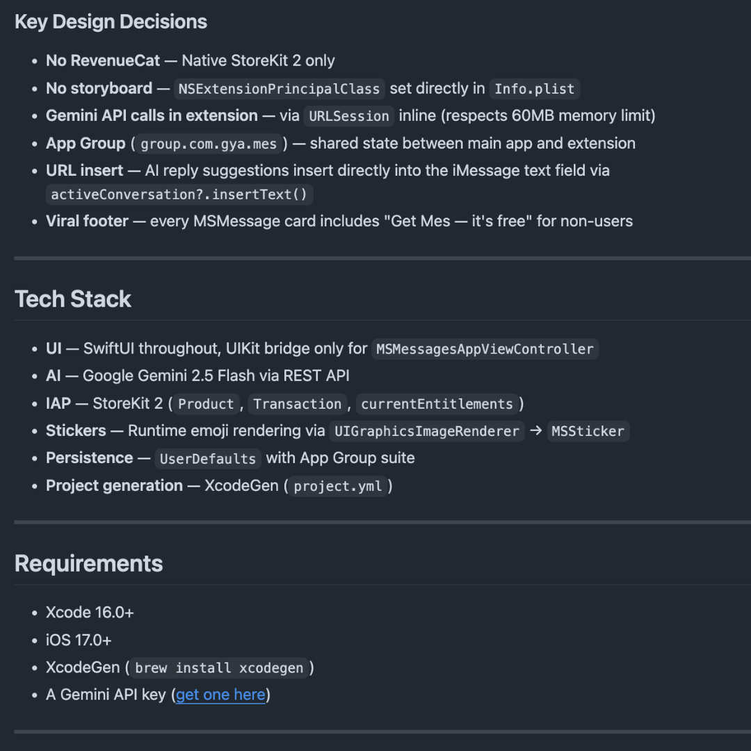
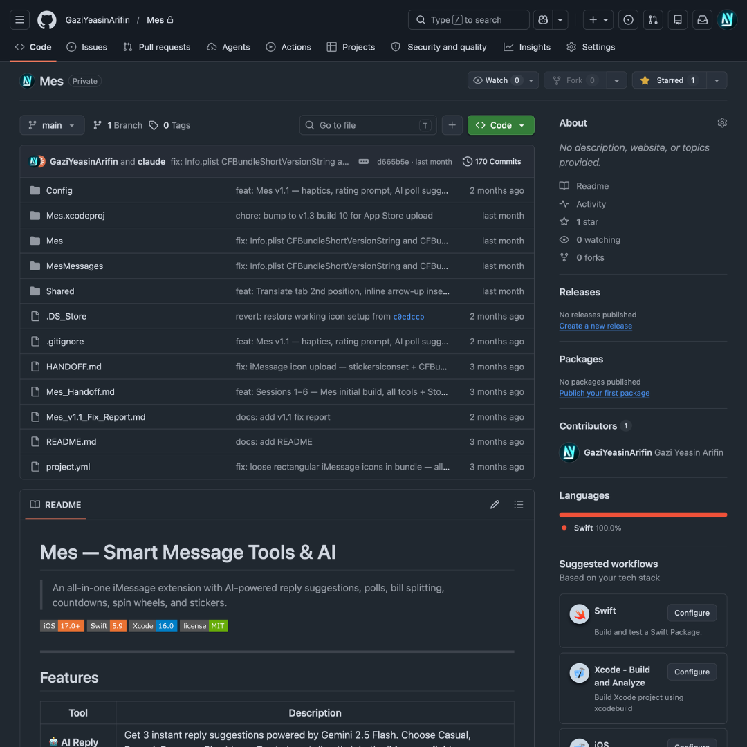
Dual-target architecture: main app (paywall, onboarding, sticker store) plus extension (all six tools), with App Group as the shared data layer and the Gemini API routed through the main app only. The constraint shaped the architecture; the architecture shaped the UX.
Dual-target architecture: main app (paywall, onboarding, sticker store) plus extension (all six tools), with App Group as the shared data layer and the Gemini API routed through the main app only. The constraint shaped the architecture; the architecture shaped the UX.
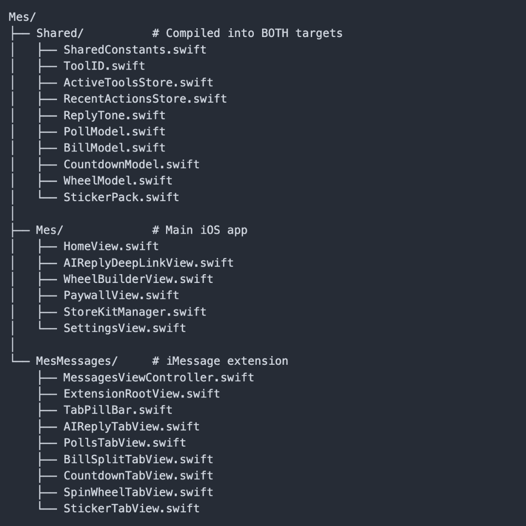
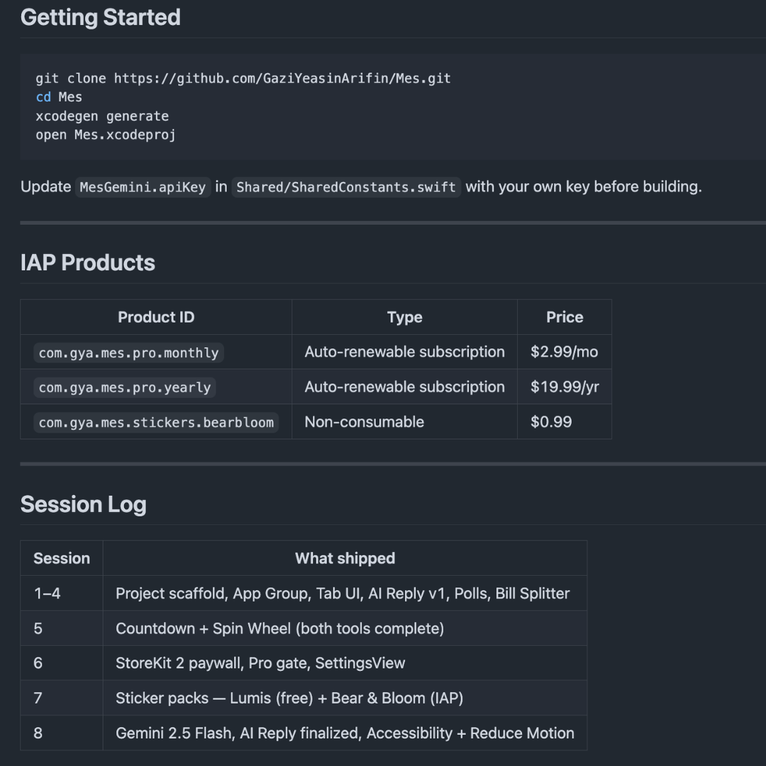
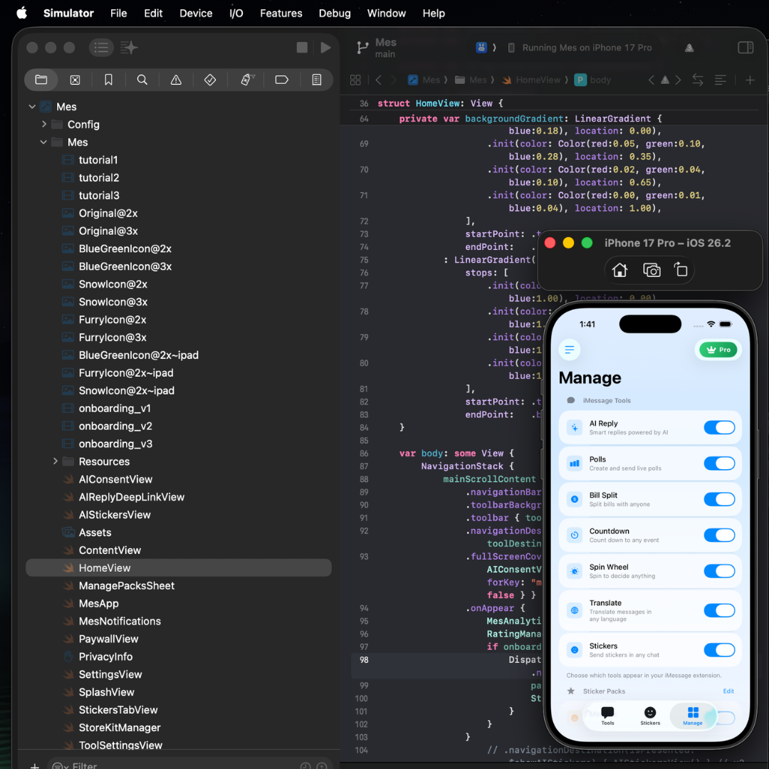
Ten build sessions across six weeks, each feature an isolated SwiftUI module. Bubble UI, liquid-glass cards, and the dark-blue extension aesthetic developed in parallel, so the visual language emerged from the components, not the reverse.
Ten build sessions across six weeks, each feature an isolated SwiftUI module. Bubble UI, liquid-glass cards, and the dark-blue extension aesthetic developed in parallel, so the visual language emerged from the components, not the reverse.

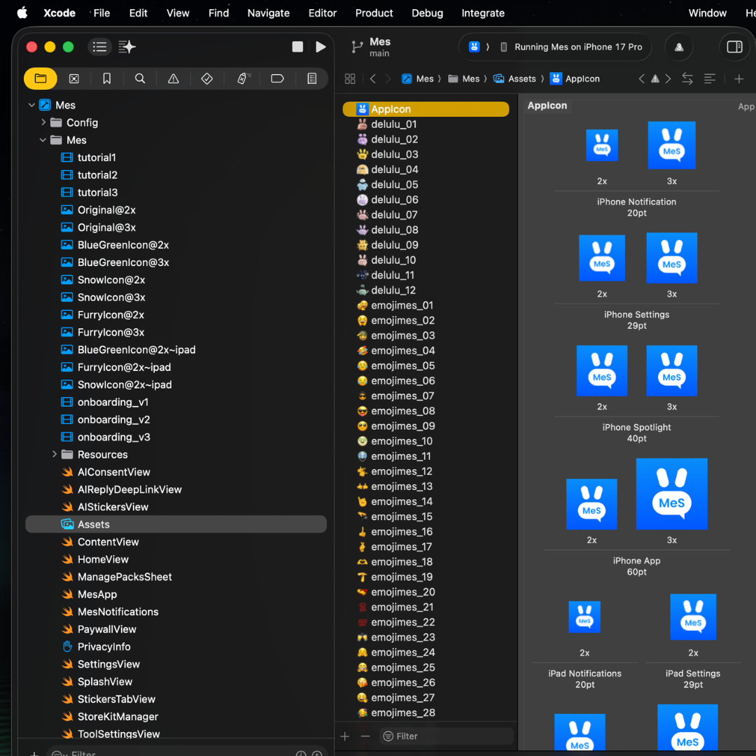
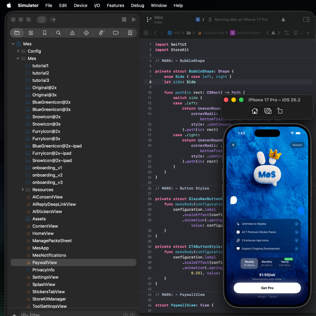
Plush bunny mascot finalized. Fluffy-fabric paywall. SF Rounded typography. Animated onboarding with looping video backgrounds. Every component documented in Swift and design files at once.
Plush bunny mascot finalized. Fluffy-fabric paywall. SF Rounded typography. Animated onboarding with looping video backgrounds. Every component documented in Swift and design files at once.
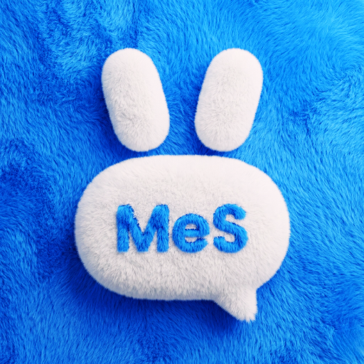
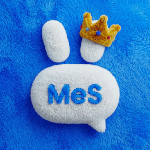
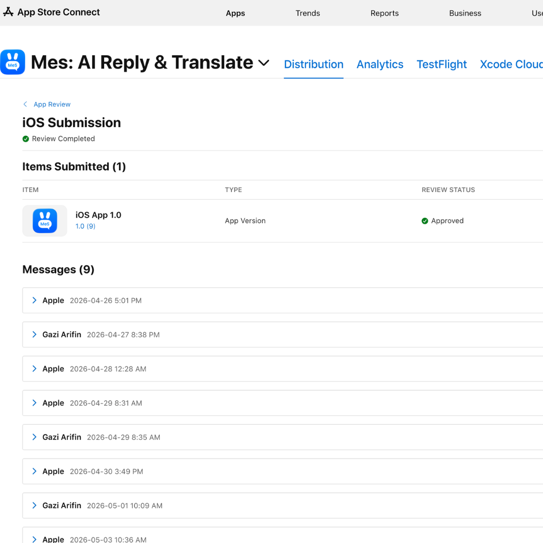
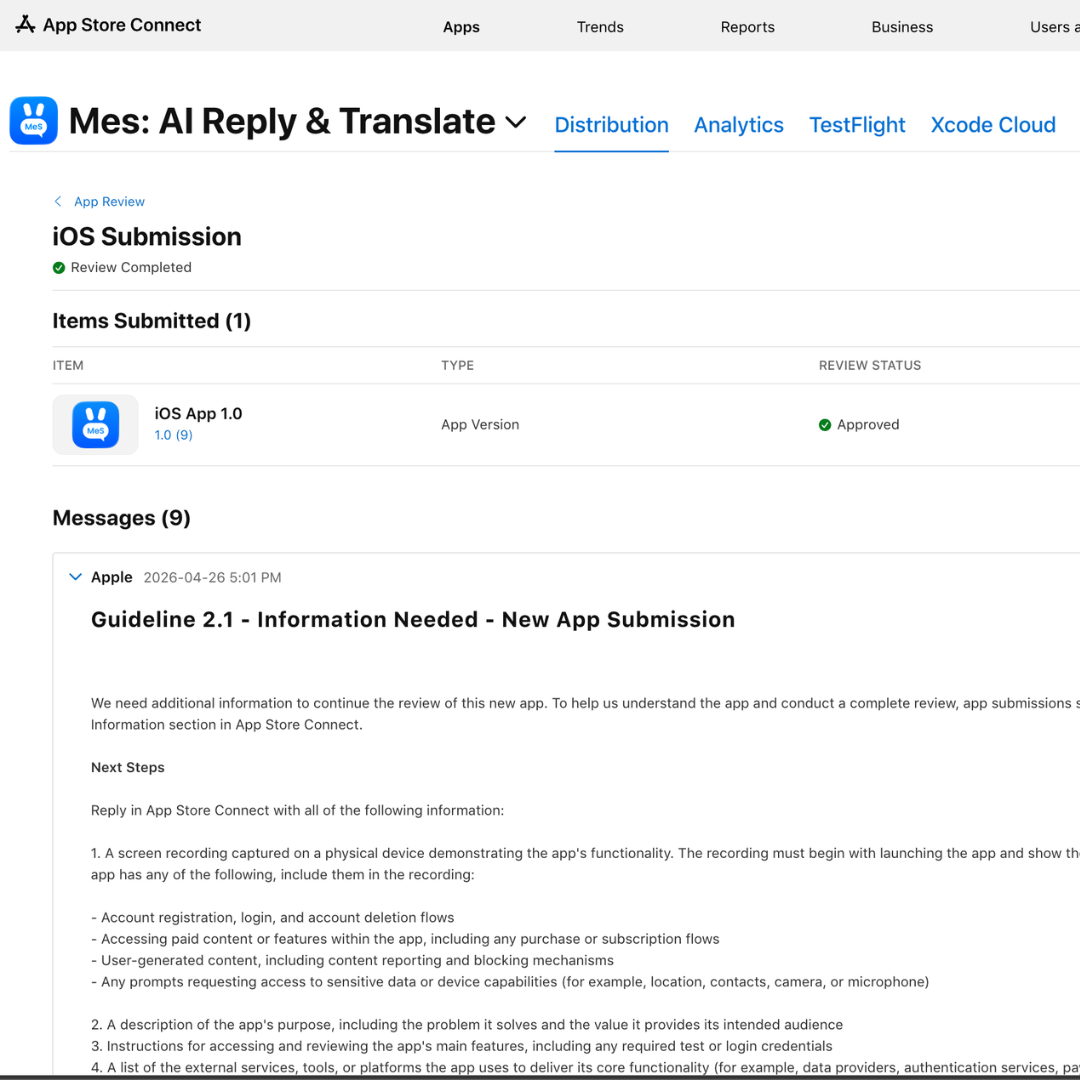
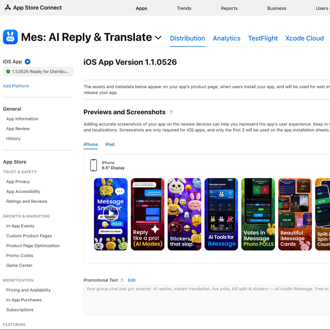
Rejected. Guideline 2.1: App Review wanted a screen recording of the IAP flow end-to-end. Guideline 3.1.2c: free-trial toggle on the paywall plus an EULA link. And the primary language was accidentally set to Danish, which App Store Connect will not let you revert.
Rejected. Guideline 2.1: App Review wanted a screen recording of the IAP flow end-to-end. Guideline 3.1.2c: free-trial toggle on the paywall plus an EULA link. And the primary language was accidentally set to Danish, which App Store Connect will not let you revert.
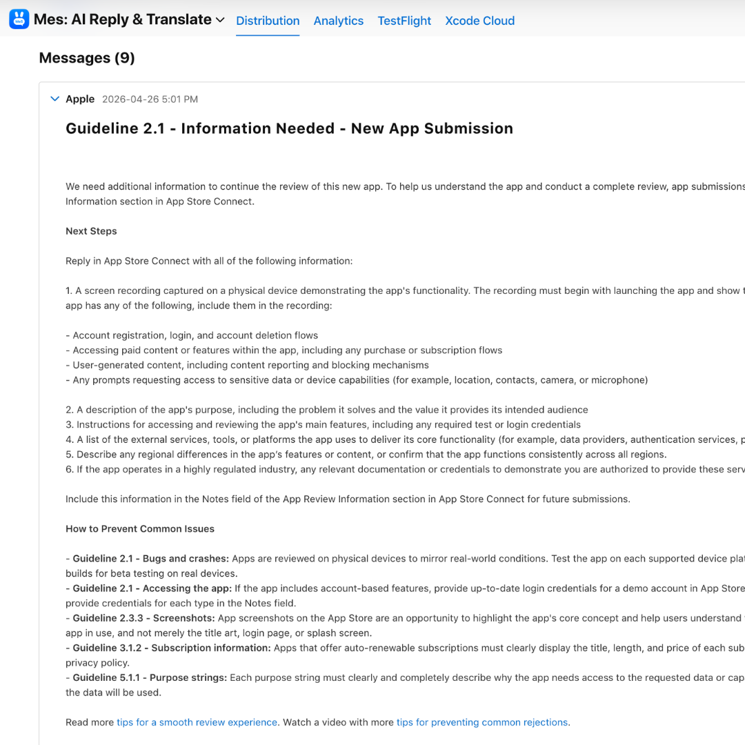
Added English (U.S.) as the primary language, filled the Danish fields with proper translations, and reconfigured the StoreKit trial flow. Shipped localization for 10 languages: ES, PT-BR, FR, DE, JA, IT, KO, AR, NL, TR.
Added English (U.S.) as the primary language, filled the Danish fields with proper translations, and reconfigured the StoreKit trial flow. Shipped localization for 10 languages: ES, PT-BR, FR, DE, JA, IT, KO, AR, NL, TR.
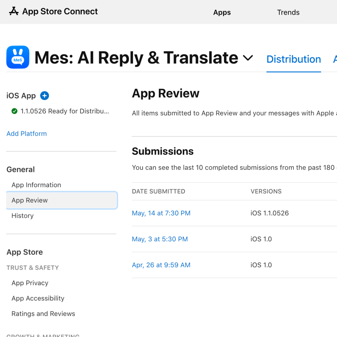
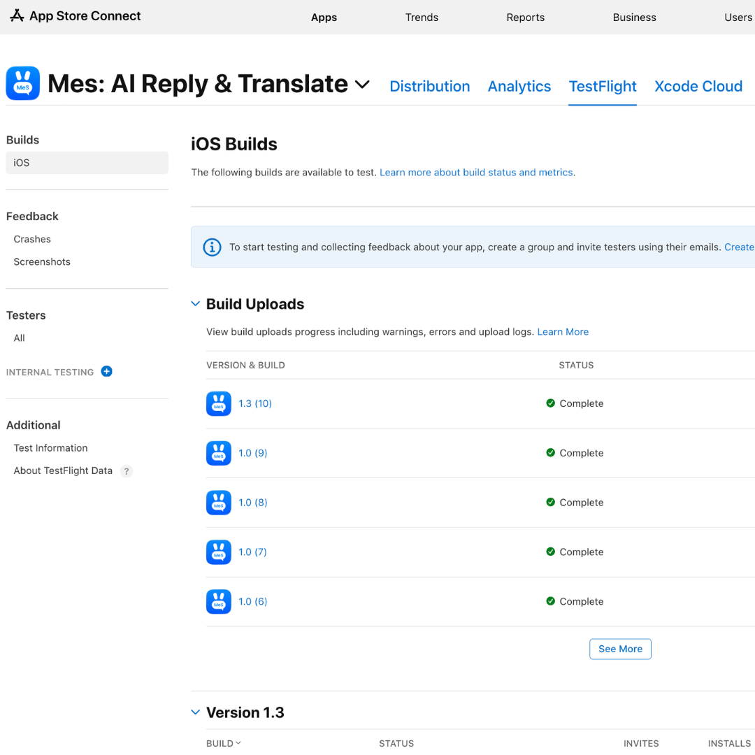
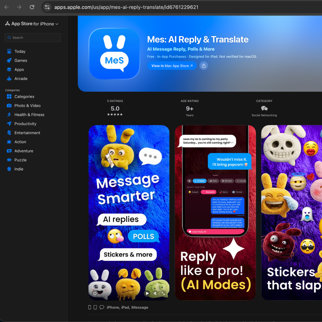
Mes: AI Reply & Translate goes live. Weekly $1.99 · Monthly $5.99 · Yearly $39.99. Six sticker packs. Ten languages. Held to that same Apple-feature quality bar from concept through ship.
Mes: AI Reply & Translate goes live. Weekly $1.99 · Monthly $5.99 · Yearly $39.99. Six sticker packs. Ten languages. Held to that same Apple-feature quality bar from concept through ship.
In most AI products, the UI displays the model's output. In Mes, the UI gives the user control over the model's voice. That inversion is the whole case study.
What I expected to be hard, getting Gemini to return good replies, was the easy part. What I expected to be easy, making users want to send an AI-generated reply, was the entire problem. Every design decision in Mes routes back to that inversion.
And it generalizes. In generative AI, agency is the trust mechanism, not accuracy: the user who steers the model trusts the result; the user who audits it doesn't. Mes is one expression of that in a consumer surface, but the same problem runs through every enterprise AI product I've used, where the model acts on the user's behalf and the user can't steer how. Same pattern, same fix.
Building Mes alone, design to code to ship, with Claude Code as my engineering partner collapsed the design-engineering loop like nothing I'd worked in before. I'd sketch a tone-chip interaction in the morning and have it in SwiftUI by lunch. The story above is the design story; the deeper one is what becomes possible when the same person owns the decision and the implementation.